Designing a functional 6-foot kitchen isn’t a matter of compromise; it’s an exercise in precision engineering that replaces the outdated kitchen triangle with a hyper-efficient linear workflow.
- Success hinges on sequencing four key zones—Cold, Wet, Prep, and Hot—to create a seamless, step-free process.
- Appliance selection is a strategic trade-off, where panel-ready integration and capacity analysis dictate the final layout, not just available space.
Recommendation: Abandon the concept of a “small” kitchen and adopt the mindset of designing a compact, high-performance culinary workstation.
The challenge of designing a full kitchen within a six-foot linear span is a defining constraint for architects and builders in the micro-living space. The conventional approach often involves a futile attempt to merely shrink a traditional kitchen, resulting in compromised functionality and ergonomic friction. Common advice revolves around using light colors and compact appliances—useful but ultimately superficial fixes. This methodology fails to address the fundamental spatial problem: a single-wall layout operates on a completely different set of principles than its larger, multi-walled counterparts.
The true task is not one of reduction, but of reinvention. It requires a shift in thinking away from accommodating separate components and towards creating a single, integrated culinary machine. The key to unlocking this potential lies in abandoning outdated spatial models, like the kitchen work triangle, which are physically and logically impossible in a linear format. Instead, a successful design must be governed by a rigorous, sequential logic that dictates the placement of every element, from the refrigerator to the cooktop.
This guide deconstructs the process, moving beyond generic tips to provide an engineering framework for architects. We will explore how to establish a linear workflow, make strategic appliance trade-offs, and leverage volumetric efficiency. By applying these precise principles, a 6-foot kitchenette can be transformed from a spatial apology into a statement of intentional, high-performance design.
To navigate this specialized design challenge, this article provides a structured approach. The following sections detail each critical decision point, from foundational layout principles to the finer points of storage and multifunctional furnishing.
Summary: Engineering the Hyper-Compact Kitchen
- Why the Traditional Kitchen Triangle Fails in Single-Wall Layouts?
- How to Hide a Dishwasher in a Kitchenette Without Losing Storage?
- 24-Inch or 18-Inch Dishwasher: Is the Space Saving Worth the Capacity Loss?
- The Open Shelving Mistake That Makes Tiny Kitchens Look Messy
- When to Use Rolling Ladders: Safety vs Space in High-Ceiling Tiny Homes
- The Measurement Mistake That Makes Modular Sofas Block Walkways
- How to Keep Air-Purifying Plants Alive in Low-Light Corners?
- How to Furnish a 400 Sq Ft Studio With Modular Pieces for Daily Hosting?
Why the Traditional Kitchen Triangle Fails in Single-Wall Layouts?
The classic kitchen work triangle—a model connecting the sink, refrigerator, and stove—is an ergonomic principle designed to minimize steps in large, multi-wall kitchens. Applying this concept to a single-wall layout of six feet is not only impractical but counterproductive. It forces an unnatural zig-zagging motion within a constrained line, creating inefficiency. The solution is to replace this obsolete geometry with the logic of a linear workflow, a concept borrowed from the hyper-efficiency of commercial kitchens. This model organizes tasks sequentially, mirroring the natural progression of meal preparation: from storage to washing, to prepping, and finally to cooking.
This assembly-line approach creates a smooth, logical, and step-free process. The refrigerator (Cold Zone) is placed at one end, followed by the sink (Wet Zone) with an adjacent landing space for groceries. Next is an uninterrupted stretch of counter for the Prep Zone, culminating in the cooktop (Hot Zone) at the opposite end. In this system, every component is exactly where it needs to be for the next step in the process. This approach is exceptionally effective for operations with focused menus and is a lifesaver in small spaces. The key is to map out this entire journey, creating a linear sequence of work zones that maintains a natural rhythm without any wasted movement.
Action Plan: Linear Workflow Zone Setup
- Cold Storage Zone: Position your refrigerator at the starting point of your linear layout.
- Wet Zone: Place your sink immediately adjacent (within 18-24 inches) for washing and initial prep.
- Prep Zone: Allocate 18-30 inches of uninterrupted counter space next to the sink. This is your primary work surface.
- Hot Zone: Position your cooktop at the end of the sequence, ensuring at least 12 inches of landing space on either side for safety.
- Path Test: Verify a clear ‘pivot-and-reach’ path, ensuring you can access all zones without taking lateral steps.
How to Hide a Dishwasher in a Kitchenette Without Losing Storage?
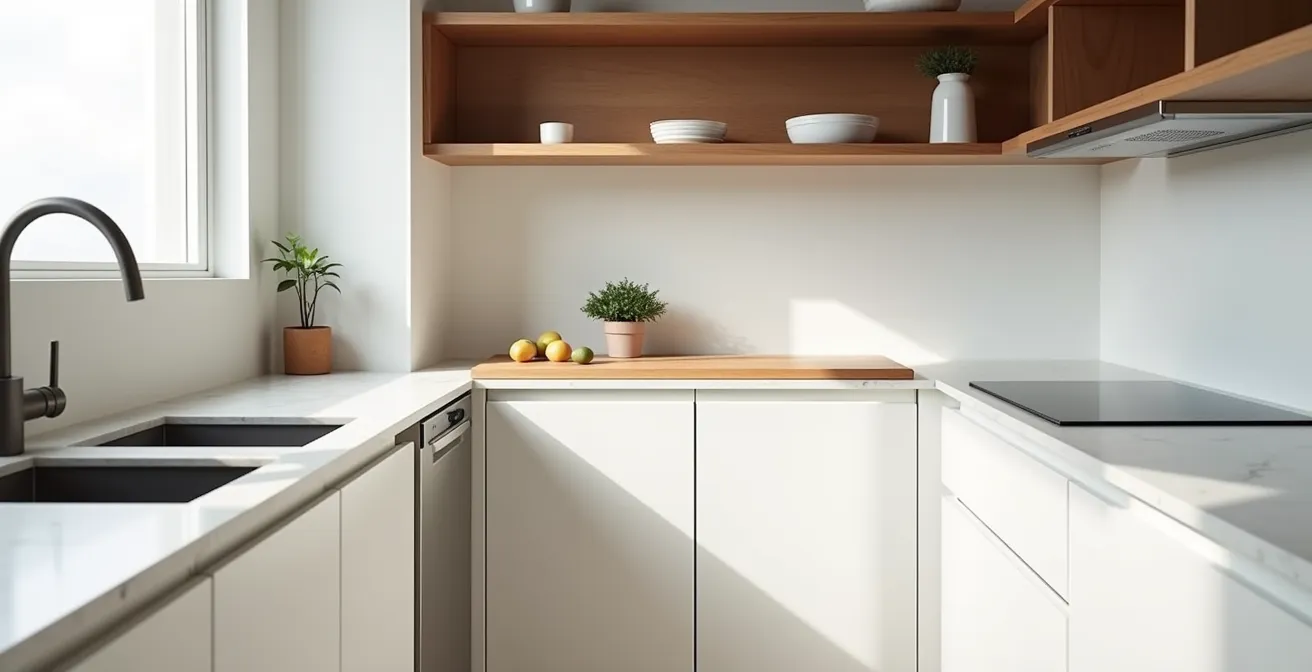
In a kitchenette where every inch is prime real estate, a standard dishwasher can be a visual and spatial disruption. The goal is seamless integration—making the appliance disappear into the cabinetry to create a monolithic, uncluttered look. The primary tool for this is the panel-ready dishwasher. This type of appliance is designed to accept a custom cabinet front, allowing it to blend perfectly with the surrounding millwork. When closed, it is indistinguishable from any other cabinet, preserving the clean lines essential in minimalist and tiny home design.
However, simply hiding the dishwasher is not enough; the decision must not come at a significant cost to storage. This is where innovative appliance formats become critical. Single drawer dishwashers are ideal for compact spaces, occupying the space of a deep drawer rather than a full-height cabinet. This preserves the drawer line and allows for a separate storage drawer to be placed above or below it. For slightly more capacity, two-drawer models allow for smaller loads to be run independently, combining flexibility with integration. The choice to integrate a dishwasher becomes an architectural decision, balancing the convenience of the appliance with the critical need for an unbroken visual plane and optimized storage volume.

As this image demonstrates, the precision of a panel-ready installation creates a flawless facade. The handle can be integrated into the panel itself, such as a recessed groove, further enhancing the seamless effect. This technique transforms a purely functional appliance into a quiet, integrated part of the architectural vision.
24-Inch or 18-Inch Dishwasher: Is the Space Saving Worth the Capacity Loss?
For an architect designing a compact kitchen, the choice between an 18-inch and a 24-inch dishwasher is a critical engineering decision, not a simple preference. The six inches of counter space gained by opting for a smaller model can be the difference between a functional prep zone and a perpetually cramped work surface. This decision must be framed as a strategic trade-off analysis weighing space, capacity, lifestyle, and even sustainability. While a 24-inch model offers capacity for 10-16 place settings, an 18-inch model typically holds around 8, making it perfectly suitable for households of one or two people.
The decision matrix should be lifestyle-based. A client who cooks daily and entertains frequently will likely find the capacity of an 18-inch model restrictive. Conversely, a client who values baking or complex meal prep will derive immense value from the extra six inches of uninterrupted counter space. Furthermore, efficiency is a key factor; modern compact models are remarkably effective. In fact, ENERGY STAR-certified compact dishwashers use less than half the energy of hand-washing and can save thousands of gallons of water annually, making them a sustainable choice.
To make an informed recommendation, it’s crucial to present the client with clear data. This can be done through a simple comparative table that lays out the core differences, informed by a detailed analysis of dishwasher dimensions and capacities.
| Feature | 18-inch Model | 24-inch Model |
|---|---|---|
| Width | 18 inches | 24 inches |
| Capacity | 8 place settings | 10-16 place settings |
| Counter Space Gained | 6 inches additional prep space | Standard fit |
| Best For | 1-2 person households | 3+ person households |
Ultimately, the “right” choice is the one that aligns with the user’s actual daily habits. An architect’s role is to guide this decision with a framework that considers cooking frequency, dish usage, entertaining style, and the true value of counter space in their specific design.
The Open Shelving Mistake That Makes Tiny Kitchens Look Messy
Open shelving is often prescribed as a solution to make tiny kitchens feel more airy and open. However, it frequently backfires, becoming a source of visual chaos that makes the space feel cluttered and smaller. The critical mistake is treating open shelves as simple storage. In a micro-kitchen, they must be treated as a curated display. Every item visible is an active part of the room’s aesthetic, and without a strict organizational and visual strategy, the result is inevitably messy. The principle of “a place for everything, and everything in its place” becomes paramount.
To succeed, open shelving requires a dedicated storage zone for each category of items, a principle borrowed from professional kitchen design. Functionally, items should be grouped by frequency of use. Aesthetically, this requires a ruthless commitment to a limited color palette and material consistency. Decanting dry goods into uniform glass containers and committing to a single color of dishware (e.g., all white ceramics) creates visual harmony and turns everyday objects into a deliberate design feature. This isn’t just about tidiness; it’s an architectural choice to create rhythm and pattern out of necessity.

This approach transforms storage from a problem into an opportunity. When curated properly, open shelving adds texture, depth, and a sense of personalized order. It requires a disciplined eye and an understanding that in a tiny kitchen, there is no “back of the cupboard.” Every surface is a foreground, and success requires a dedicated storage zone for each category of items to maintain order.
When to Use Rolling Ladders: Safety vs Space in High-Ceiling Tiny Homes
In tiny homes with high ceilings, the upper regions of cabinetry represent a significant volume of potential storage. Accessing this space safely and efficiently is a design challenge. While a simple step stool is an option, it requires its own storage footprint and can be unstable. The rolling library ladder emerges as an elegant and spatially efficient solution, transforming vertical storage from an inconvenience into a design statement. It serves as the linchpin of an optimized storage strategy, providing secure access to high cabinets without consuming floor space when not in use.
The decision to incorporate a rolling ladder is a balance of safety, cost, and aesthetics. A properly installed ladder on a secure rail is far safer than a freestanding stool, especially when retrieving heavy items. However, it represents a greater initial investment than other solutions. Alternatives like pull-down cabinet systems offer supreme safety and zero footprint but come at an even higher price point and with mechanical complexity. An architect must present these options clearly to the client, framing the ladder not just as an access tool but as a permanent, functional piece of furniture that enhances the room’s character.
A comparative analysis helps clarify the trade-offs. The following table breaks down the primary high-access solutions, providing a clear basis for an informed decision, as this comparison of high-access storage solutions illustrates.
| Solution | Cost Range | Safety Rating | Space Footprint |
|---|---|---|---|
| Rolling Library Ladder | $800-2,500 | High (with proper rail) | Minimal – uses vertical space |
| Pull-Down Cabinet System | $1,500-3,500 | Very High | None (integrated) |
| Step Stool with Rail | $150-400 | Medium | Requires storage space |
For the right project—one with sufficient ceiling height and a design that embraces visible hardware—the rolling ladder is more than a utility. It’s an architectural element that signals a commitment to maximizing every cubic inch of space with intelligence and style.
The Measurement Mistake That Makes Modular Sofas Block Walkways
Transitioning from the kitchen to the greater living area, the same principles of precision and workflow apply, especially when using modular furniture. Modular sofas are a cornerstone of flexible small-space living, but their adaptability can conceal a critical design flaw. The single most common measurement mistake is accounting for the sofa’s footprint only in its most compact configuration. This oversight can lead to blocked walkways, unusable adjacent furniture, and a frustrating daily experience when the sofa is expanded into its guest-hosting or lounging mode.
To avoid this, an architect must map out the “kinematic footprint” of the furniture—its full range of motion and all its potential configurations. This means drawing floor plans not just for one static layout, but for all primary use cases: ‘daily living,’ ‘guest sleeping,’ ‘social gathering,’ etc. The critical metric is maintaining a minimum clearance of 30-36 inches for all major circulation paths *in every configuration*. This ensures that even when a sleeper module is pulled out or sections are rearranged, the path from the entrance to the kitchen or bathroom remains clear and comfortable.
This mistake often occurs when designers focus on the dimensions of a single module rather than the aggregate dimensions of the piece in use. A chaise lounge that fits perfectly in one spot might completely obstruct a doorway when moved to another. Therefore, the design process must include taping out the various footprints on the actual floor of the space before purchase. This simple, practical step makes the spatial consequences of the furniture’s modularity tangible and prevents a costly and disruptive error.
How to Keep Air-Purifying Plants Alive in Low-Light Corners?
Biophilic design, the integration of nature into the built environment, is particularly impactful in small spaces, where a touch of green can significantly enhance wellbeing. However, the ‘low-light corner’ is often the only available spot for a plant, and it’s notoriously difficult to keep anything alive there. Success depends on a two-pronged strategy: first, architecturally maximizing the available light, and second, selecting plants genetically suited to thrive in minimal-light conditions.
Before even choosing a plant, an architect can employ design tricks to amplify ambient light. As homeowner and designer Stefanie Watts of Watts Design House demonstrated in a compact kitchen with low ceilings, thoughtful material choices are key.
The ceilings in this cozy green kitchen top out at just six feet, so homeowner Stefanie Watts of Watts Design House used light-reflecting tile as a counter-to-ceiling backsplash to brighten the small space.
– Stefanie Watts, Country Living
This principle of using reflective surfaces—such as glossy tiles, a strategically placed mirror, or light paint colors with a satin or semi-gloss finish—can bounce light into darker corners, increasing the available photons for photosynthesis. The second step is plant selection. Forget light-loving succulents or ferns. The focus must be on famously durable, low-light tolerant species. The “architect’s shortlist” for these conditions includes the Snake Plant (Sansevieria trifasciata), the ZZ Plant (Zamioculcas zamiifolia), and the Cast Iron Plant (Aspidistra elatior). These plants are not just tolerant of low light; they are also remarkably forgiving of inconsistent watering, making them ideal for busy clients.
Key Takeaways
- The traditional kitchen triangle is obsolete in linear layouts; a sequential “Cold-Wet-Prep-Hot” workflow is the key to efficiency.
- Appliance selection is a strategic matrix of trade-offs, where integrating panel-ready models and analyzing capacity vs. counter space is paramount.
- True volumetric efficiency is achieved by planning for high-access storage with solutions like rolling ladders and designing for the “kinematic footprint” of modular furniture.
How to Furnish a 400 Sq Ft Studio With Modular Pieces for Daily Hosting?
Furnishing a 400-square-foot studio for both comfortable daily living and frequent hosting is the ultimate test of micro-spatial design. The solution lies in a disciplined application of modular, transformable furniture, governed by the principle of “Kinetic Design”—a focus on the speed, ease, and ergonomics of transformation. The space must be able to convert from a private living area to a social hosting space in under five minutes. This requires a curated selection of furniture where every piece serves at least two functions.
The core components of such a space typically include a high-quality murphy bed that integrates a sofa or a desk, an expandable dining table that can go from a two-person console to a six-person table, and nesting or stacking chairs. However, the selection criteria must go beyond mere transformability. The mechanism matters. A murphy bed should deploy in under three minutes with minimal effort. An expandable table must have a simple, tool-free leaf system. Lightweight modular seating with easy-grip components is preferable to heavy, cumbersome pieces. Open-concept work zones help make the space feel bigger and more inviting, promoting better interaction for cooking, entertaining, and working.
A successful layout requires rigorous planning to ensure smooth traffic flow during transformation. This means maintaining at least 36 inches of clearance around all sides of furniture when it is in its fully expanded state. This ensures the process of converting the space is fluid, not a frustrating puzzle. The goal is to create a home that feels spacious and purpose-built for each activity, rather than a compromised space trying to be everything at once.
To put these principles into practice, the next logical step is to begin sketching floor plans that map out not just the static furniture placement, but the full kinematic footprint of each transformable piece, ensuring your design is as functional in motion as it is on paper.